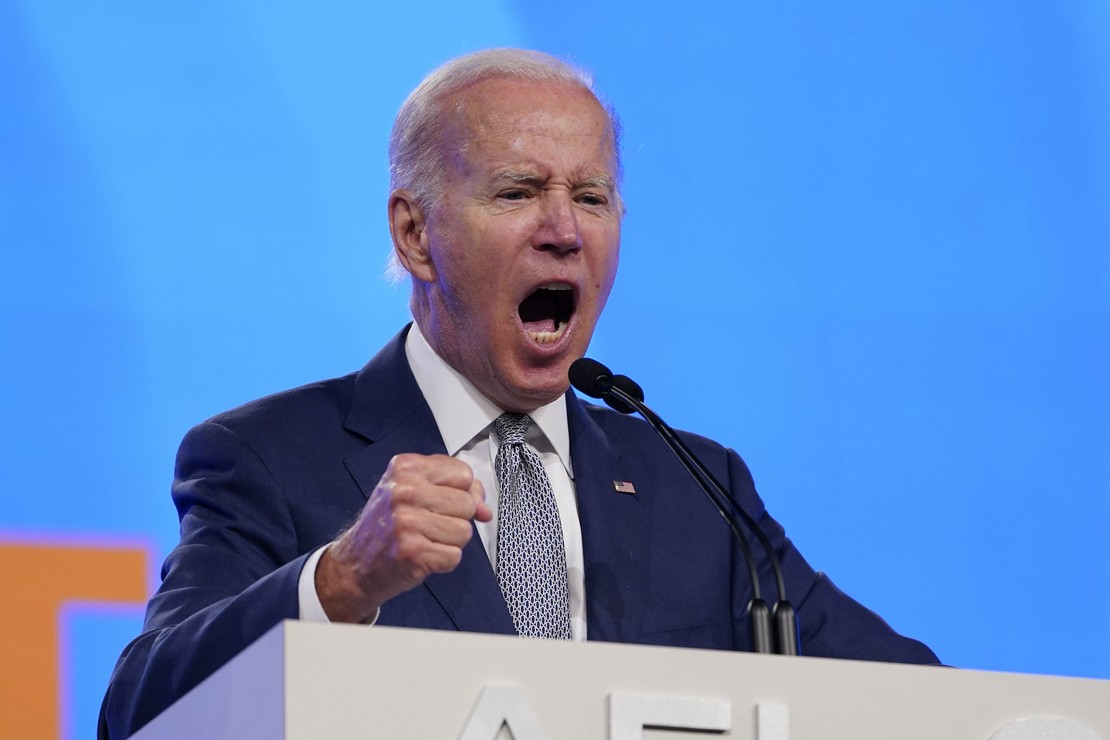
Want to know why Joe Biden’s personal favorability numbers have crashed along with his job approval? In large part, it’s because of dishonest attempts to dodge blame for his own disastrous economic and energy policies — and this is just the latest example.
Yesterday, in an attempt to dodge the political fallout from yesterday’s CPI report showing 9.1% inflation, the White House made two claims. First, Biden put out a statement that the CPI report was already “out-of-date” because gas prices had fallen significantly:
BIDEN says CPI data is “out of date” because gas prices have fallen. pic.twitter.com/9ZkJkcvvSS
— Jake Sherman (@JakeSherman) July 13, 2022
Then just a few hours later, Biden accused “gas retailers” of keeping prices too high, claiming that they have experienced “declines” in their costs. The White House helpfully provided this chart to make that claim, which is not just specious but intentionally dishonest:
It’s time for gas retailers to pass the cost declines they’re feeling in the market onto American families at the pump. pic.twitter.com/ZvprQzWYBY
— President Biden (@POTUS) July 13, 2022
First off, crude oil prices don’t immediately impact retail gas prices for the obvious reason that crude oil has to get refined before it comes to gas stations. Gasoline also only accounts for about half the products of crude-oil refining, with diesel being another quarter of the output and the rest split between other products and jet fuel. Refining a barrel of crude oil takes around a month to accomplish, after which the transport of the product adds some additional time, so the purchase price of a barrel of oil on one day will only have any impact on price a month or so down the road, to the extent that it has impact at all. There are a number of other factors too, such as the projected price to replace the current inventory of the retailers, that come into play with pricing.
However, that’s not the extent of the dishonesty in this chart. Take a look at the axes on either side. Why did the White House use nominal dollar figures in this manner rather than rates of increase/decrease, which can be expressed in common percentages? And why did Biden’s chart use a range that starts at $90 a barrel and $3:30 a gallon rather than a zero-line reference?
Here’s one reason why:
What’s wrong with this chart?
READ RELATED: Baltimore family files a $25 million federal civil rights lawsuit against Sesame Place claiming racial discrimination
The axis for oil prices has a spread of 38% between the top price and bottom price. The axis for gas prices has a spread of 54% between top and bottom.
That forces the oil price decline to be look much more dramatic. 1/2 https://t.co/CIHhOngfii
— Ed Morrissey (@EdMorrissey) July 13, 2022
Just based on my back-of-the-envelope calculations, I estimated last night that the barrel price range would need to start at $67.50 to have roughly equal ranges on both sides of the chart. A couple of followers reminded me that even that won’t solve the problem, as charts really should start with a zero reference, especially for comparisons.
Thankfully, Steve Maley — among those who pointed out the zero-reference issue — put together a properly crafted chart showing both trends on a percentage basis, starting at the beginning of the year. And to no one’s surprise, the honest data tells the opposite story that Biden and the White House claims:
Here’s what happens when you *don’t* cherry-pick data, @EdMorrissey. Same data the White House used, they just zoomed in on the blue box, and picked June 6 as their reference. I used Jan 3. 1/2 pic.twitter.com/UURqpB3D8E
— Steve Maley (@DerekBarge) July 14, 2022
Instead of showing that gas retailers are somehow gouging consumers, this chart shows — accurately — that the rate of increase in gas prices has remained fairly well linked to the rate of increase in crude oil prices, perhaps even more than we might expect. It also demonstrates the deep dishonesty built into the Biden chart and his claims that gas station owners, the vast majority of which are small-business owners, are the villains of gas-price inflation. They cooked the chart, the scale, and the scope to tell a lie in order to let Biden escape responsibility for the economic and energy policies he put in place.
All of this underscores Biden’s collapse, and the conclusions voters have clearly drawn about Biden at this point:
He’s a bad person, and always has been.
— Charles C. W. Cooke (@charlescwcooke) July 14, 2022
Source:


